
please note this:
- # = id
- . = class
- rgba = red,green,blue,alpha(opacity)
- webkit = chrome or safari
- moz = mozilla firefox
today, i will show you how to use CSS3.
its more advanced than usual CSS and more beautiful result u will get!
First, make a html file like this...

<!DOCTYPE html>

<html>
<head>
    <title>CSS part 2</title>

<style type="text/css">
body {
    background-color: #DDF;
    font-family: calibri;
}
#content {
    border: 3px solid #FFF;
    background-color: #FFF;
    padding: 5px;
}
</style>

</head>

<body>

<div id="content">
    this is my css!
</div>

</body>
</html>
This is basic html and css right?
Border-Radius
add this line to #content:
border-radius:8px 8px 8px 8px;
    -moz-border-radius:8px 8px 8px 8px;
    -webkit-border-radius:8px 8px 8px 8px;

RESULT:

How it works?

Some note for you:

this is important thing for make your page proper on all browser...
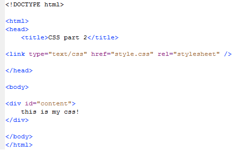
External Stylesheet
Usually u have to put something likethis on header tag:
<style type="text/css">
</style>
try copy all your css code after STYLE tag
paste on notepad (remember to remove above tag)
and named it to style.css make sure to save as all files.

Add this line to head tag
<link type="text/css" href="style.css" rel="stylesheet" />
Preview:
u have to put the style.css along with your HTML (on same folder)
Box-shadow
take a look for this picture first.
might can help u to more understand

to try by yourself,
add this line to your div,
and see what happened!
OUTER SHADOW:
-moz-box-shadow: 2px 2px 0px 0px rgba(0,0,0,0.5);
    -webkit-box-shadow: 2px 2px 0px 0px rgba(0,0,0,0.5);
    box-shadow: 2px 2px 0px 0px rgba(0,0,0,0.5);
its must be like this:

if u want to position your shadow, just change the 1st and 2nd value,
and adjust the shadow to blur (more nice)
example:
-moz-box-shadow: 0px 0px 3px 1px rgba(0,0,0,0.5);
    -webkit-box-shadow: 0px 0px 3px 1px rgba(0,0,0,0.5);
    box-shadow: 0px 0px 3px 1px rgba(0,0,0,0.5);
INNER SHADOW:
okay...its looks more nice than before...
how about shadow inside the table?
chek this out
-moz-box-shadow: inset 0px 0px 3px 1px rgba(0,0,0,0.5);
    -webkit-box-shadow: inset 0px 0px 3px 1px rgba(0,0,0,0.5);
    box-shadow: inset 0px 0px 3px 1px rgba(0,0,0,0.5);
(just add inset before first value)RESULT:

Text-shadow
in text shadow, no inset available
only this code is valid...
if you have more experience about coloring,
you can make inset effect :)
Add span tag around your text
<span id="text">this is my css!</span>
add this on CSS:
text-shadow: 0 0 24px #FFF, 0 0 4px #999, 1px 1px 2px #999;
here the result:

FINAL CODE:
HTML
<!DOCTYPE html>

<html>
<head>
    <title>CSS part 2</title>

<link type="text/css" href="style.css" rel="stylesheet" />

</head>

<body>

<div id="content">
    <span id="text">this is my css!</span>
</div>

</body>
</html>
CSS
body {
    background-color: #DDF;
    font-family: calibri;
}
#content {
    border: 3px solid #FFF;
    background-color: #FFF;
    padding: 5px;
    border-radius:8px 8px 8px 8px;
    -moz-border-radius:8px 8px 8px 8px;
    -webkit-border-radius:8px 8px 8px 8px;
    -moz-box-shadow: inset 0px 0px 3px 1px rgba(0,0,0,0.5);
    -webkit-box-shadow: inset 0px 0px 3px 1px rgba(0,0,0,0.5);
    box-shadow: inset 0px 0px 3px 1px rgba(0,0,0,0.5);
}
#text {
    text-shadow: 0 0 24px #FFF, 0 0 4px #999, 1px 1px 2px #999;
}
this is major CSS code that almost all wen using this.
if you have some question, just ask me!
wait for next part! stay updated!
-by TommyRaudy-
0 comments:
Post a Comment